WWII History & Reenacting

The Youtube Studio
In late August 2020 I decided to build a permanent YouTube studio, and on the 25th of September I released a channel update video revealing the new studio, as well as celebrating hitting the 16 000 subscriber mark.
Creating the studio backdrop
How it was built and the reasoning behind it all

The hart and soul of the studio
The hart and soul of the studio
I decided to try my best to create something different, unique and visually pleasing as a backdrop for my new Youtube studio. I had a few different ideas floating around in my head, but nothing really gave me the fizz until the idea of painting wall mural in typical German military fashion hit me - and I had a particular design in mind. I drew inspiration from an original German wall mural from 1942 painted on the wall of a officer's mess in my hometown of Kristiansand (Norway), that first caught my eye many years ago as it was removed from the original building and re-erected in a local museum. I actually own several original photos in my collection belonging to the artist with a photo of this particular painting in its completed state, along with a couple other photos of other motifs in the same building, as well as photos of him as he is painting some of them.
So I now had multiple referanse pictures to go from, but as you will notice further down in this article, I was forced to make some minor adjustments to make the motif fit my backdrop. I did this for a number of reasons, but the main reason was to make the less "important" middle part of the mural bigger to allow space for myself in front of the painting without blocking out important parts. After some slight calculations and figuring I decided on a scale to go from and went all out freehand and adjusted on the fly. I made many mistakes along the way, but I was able to adjust, adapt and overcome these issues to the best of my ability. I primarily used acrylic paints for this project, and it worked out fine. As this was my first ever wall mural, and my first attempt on creating art since kindergarten or primary school, I probably bit of more than my skill level allowed - but I am actually happy with how it turned out in the end. My plan from the beginning was to create the impression that someone had cut away part the newer wall that was placed over the old existing wall exposing the old wall mural underneath. I thought that was a nice touch, creating sort of a frame around the artwork and giving it some depth and dimension. On the inside, behind the paneling I strung a line of christmas lights hidden along the perimeter of the opening to help illuminate the mural. The "false wall" paneling was painted in a warm dark green/blue colour to make a nice contrast to the artwork inside.
Left: The part of the wall that was removed and how it is displayed today.


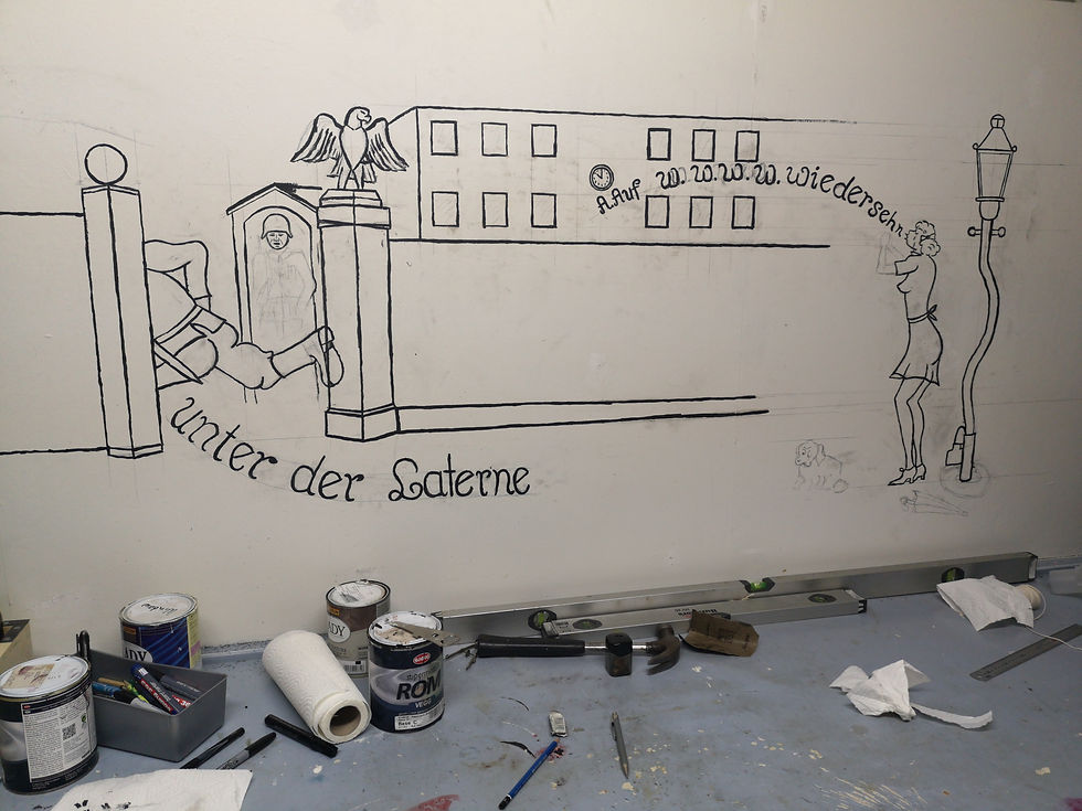
Left: The initial pencil sketch in progress. Drawing on a vertical surface (wall) is quite awkward and difficult. After sketching I started painting. On this photo the outlining is nearly completed.
Right: A closeup of the sketching process - note all the guidelines. I drew those lines onto the wall using a level.


Left/above: I was not happy with the white background and decided to delude some paint to create a wasch for the backdrop. Luckily the sketching and outlining I did beforehand was still visible through the wash and all I had to do was retrace it. Although Im very happy with the final result, next time I would definitely make sure think the project through before jumping into it.


Above: A series a photos showing the process and various stages of the painting. It turned out to be a more difficult than I had first anticipated.

Left: The finished wall mural before the construction of the false wall. I had to make some minor modifications to the original motif in order to make it fit my backdrop design. I added some extra "W", stretched the wall - as well as the building. In hindsight I probably should not have paint directly on to the wall itself - rather used a large piece of plywood, canvas or particle board as my surface. At least it would be easier if it had to be moved or removed without destroying it.

Above: The finished youtube studio backdrop framed and painted - I later decided to paint the raw-cut edges of the panelling black as it was a little bit distracting. The false wall protrudes about 5 centimetres from the murall.

Above: I added some lights behind the falls wall to illuminate the painting to help give the scene some depth - the mural now really looks like it is recessed into the wall.

Left: The finished wall mural - after adding the false wall/frame. I later decided to paint the raw-cut edges of the panelling black as it was a little bit distracting. The false wall protrudes about 5 centimetres from the murall.
Right: Personally I feel that the new studio has a unique and interesting theme that really adds to the overall production quality in the videos - and I am really happy that I decided to give it a shot, even though my painting skills and experience is probably considered below par. Luckily it looks better from a distance!


